Challenge
The product display pages on The Cotswold Company’s e-commerce site were underperforming, with lower-than-expected conversion rates and customer engagement. Through analytics, session recordings, and journey mapping, I identified several compounding issues:
- Inconsistent product descriptions: Poorly structured information made it harder for users to make confident purchase decisions.
- Low engagement with secondary content, such as reviews, product specifications, and delivery options.
- Redundant product listings: Variations were displayed as separate products, which cluttered the pages and made browsing overwhelming.
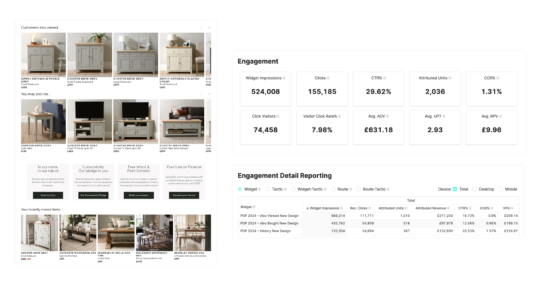
- Ineffective product recommender widgets: Recommendations were too generic and lacked personalisation. Enhancing them with browsing history and dynamic “Related Products” widgets was identified as an opportunity to drive additional engagement and revenue.
The goal was to enhance the user experience by addressing these pain points and driving improvements in both conversion rates and revenue per session.
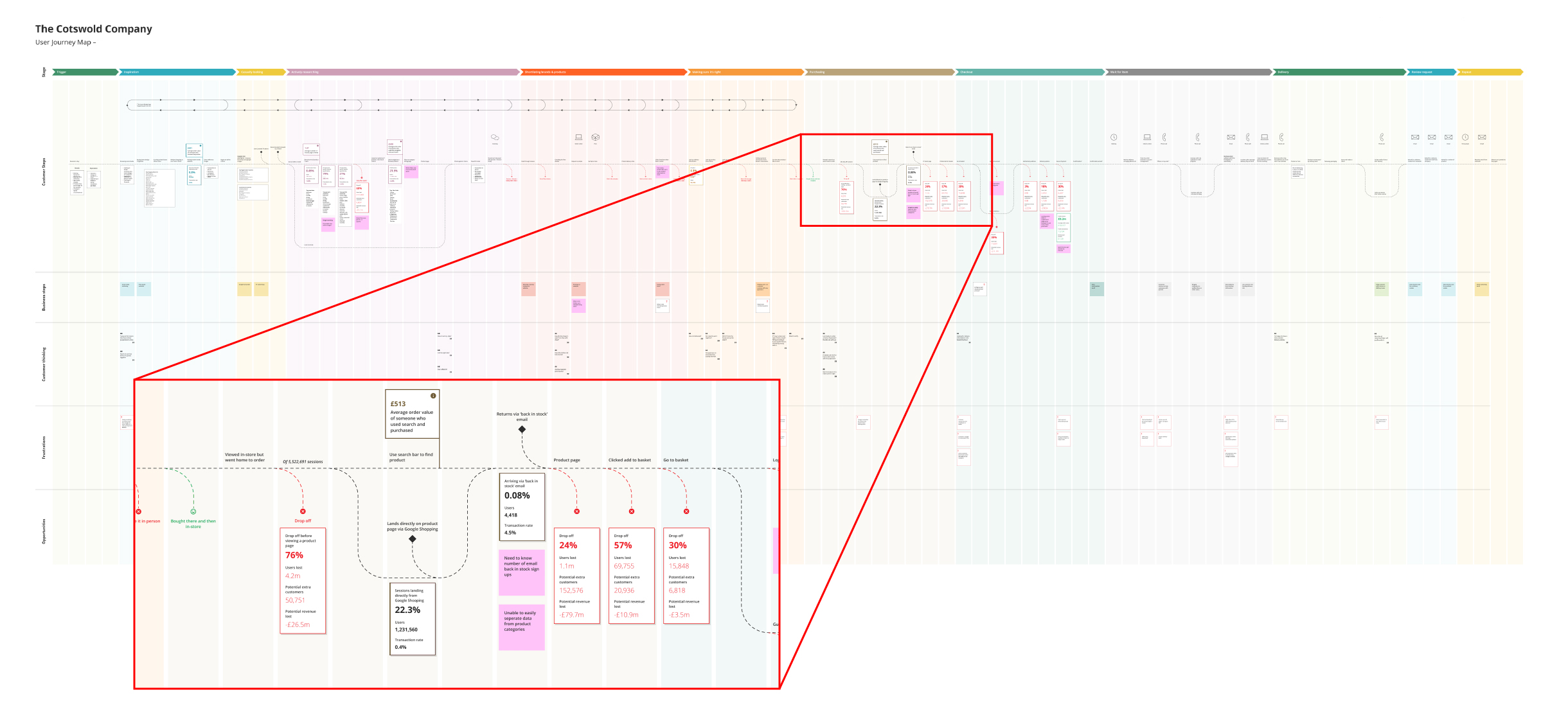
Process
1. Research and Analysis
- Analytics and session recordings: I reviewed which page elements users engaged with, and where navigation broke down.
- User surveys: I ran surveys to gather qualitative data on pain points directly from customers.
- Unmoderated live website testing: I used this to surface common pitfalls in the existing experience.
- Baymard Institute: I used Baymard’s best practice guidelines and UX research library to inform my decisions.
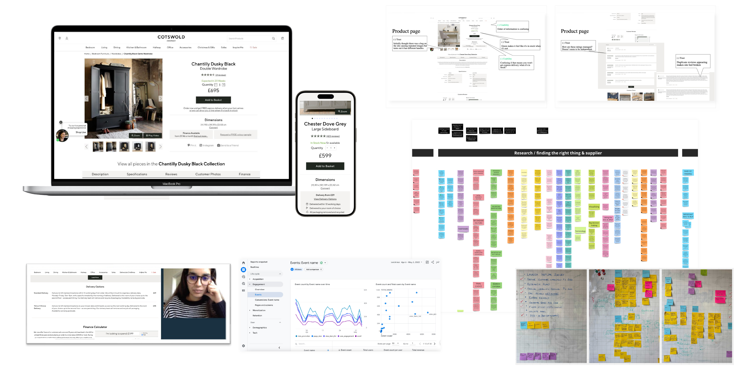
- Key Insights:
- Some users were unaware that selected items are available in various colours or size options.
- The lack of a consolidated view for variable products resulted in unnecessary navigation between pages.
- Delivery information was not easily discoverable.
- Image galleries were underutilised due to unintuitive navigation.
- Low engagement rates with all supplementary content, users were scrolling the page but not finding what they were looking for. Users missed horizontal tabbed sections.
2. Design Iteration
- Prototyping:
- Initial rough wireframe sketches were translated into low-fidelity wireframe layouts, grouping product variations (colour, size) under a single PDP with a clear selection interface, and moving the overall template from a single long page with horizontal tabs to a vertical, accordion-based collapsed-section pattern.
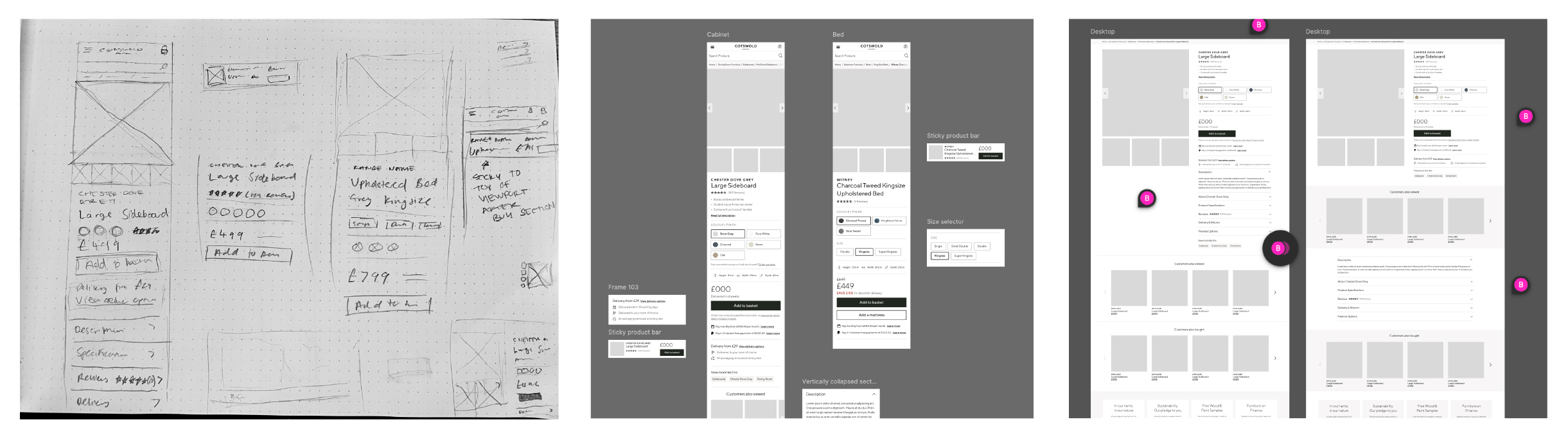
- Testing and validation:
- I developed the wireframes into high-fidelity interactive Figma prototype, and used the Maze platform to conduct unmoderated prototype testing with real users. This validating some design decisions, and delivered insights for further iterations.
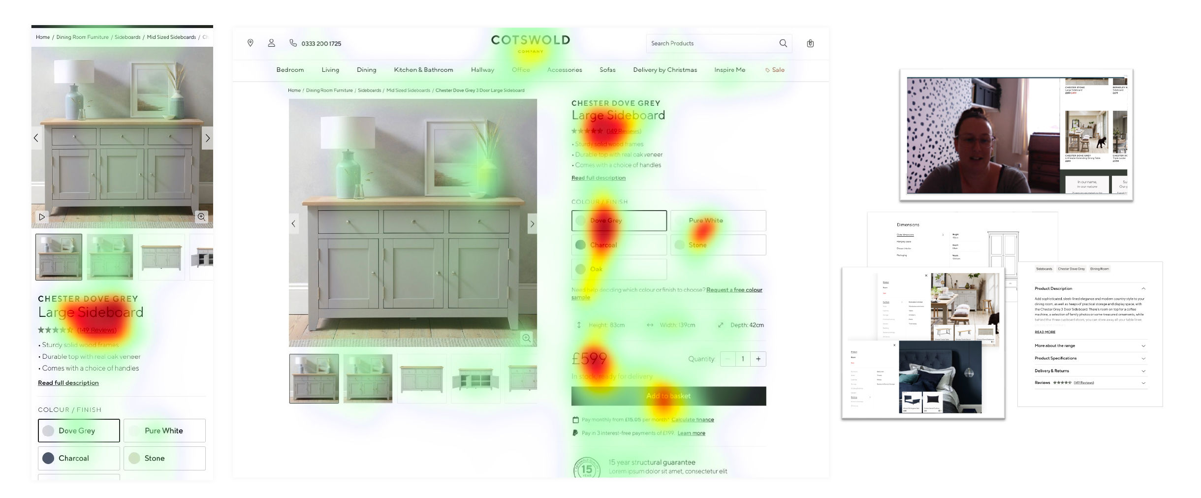
This was followed up with further rounds of unmoderated prototype testing, and one-on-one moderated usability testing sessions to finalise the design.
Solution
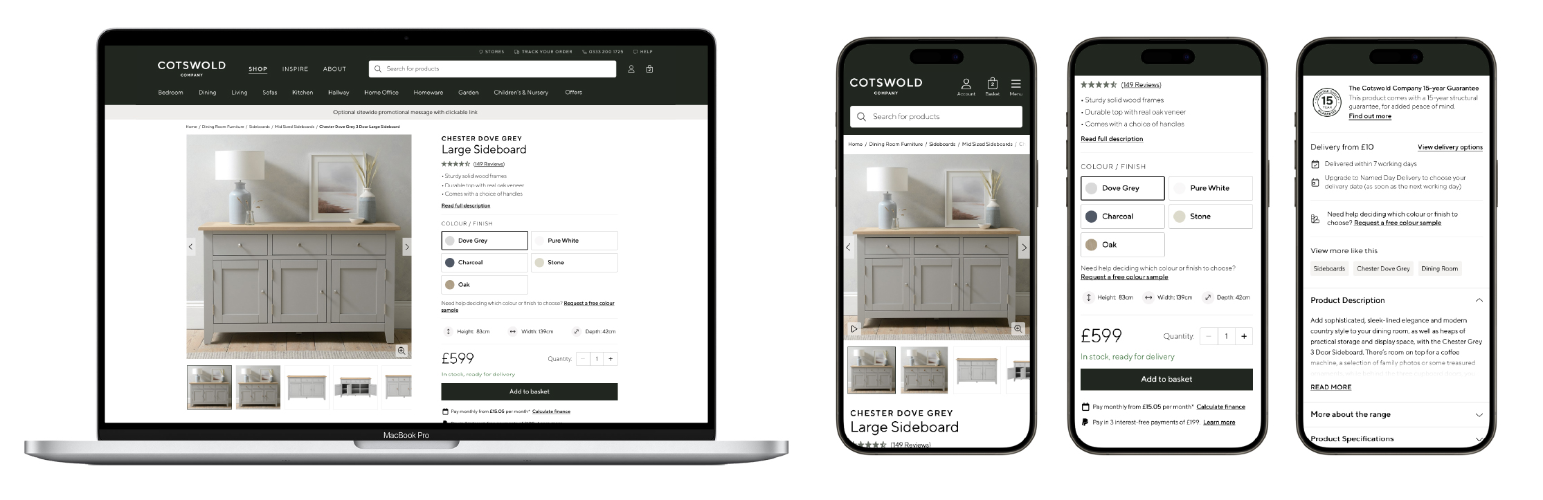
Introduced a redesigned PDP template with a clear visual hierarchy, using vertically collapsed sections:
In testing, only 10% of users overlooked secondary content in the redesigned layout, compared to 65% in the original layout, improving key information discovery.
- Introduced a new product summary section, displaying three bullet points highlighting key product attributes. Leveraged the use of generative AI to generate these bullet points from product attributes and descriptions.
Introduced new product recommender widgets, splitting a single generic widget into multiple personalised widgets:
Collaborated with Buying and Marketing teams to audit and create new guidelines for optimal product description and attributes.
The user insights and improved performance informed and accelerated the business case for a project to implement a new Product Information Management system.
Results
+11%
Conversion Rate
+23%
Revenue Per Session
+28%
Engagement rate
Key takeaways
- Insight Led Design: Combining analytics with user research was key to identifying and prioritising areas for improvement.
- Iterative Process: Regular testing and feedback allowed us to refine the designs and ensure they met user needs.
- Collaboration: Close collaboration across teams ensured a seamless execution that balanced business objectives with user-centric design.


